
“Propaganda by Design” explores the topic of ethics and visual communication, defining propaganda, and the designer’s role and responsibility in reducing misinformation. I highlighted effective methods that can be used to create persuasive or misleading ad campaigns, such as conflicting or undermining messaging, and extreme photo editing to elicit emotional manipulation.
This experiment with a panel of participants resulted in more awareness surrounding the topic of propaganda, and the darker implications of what can happen without proper research or careful consideration.

The presentation above walks you through the process that I used to create the campaigns and evaluate the results. I created several assets during my research such as multiple logos, poster campaigns, web surveys, social media accounts, a book, and more. These were all used throughout the campaigns to create controlled environments that would allow me to evaluate and track the campaign's effectiveness in a more consistent and unbiased way.

This is the book I wrote and designed to document the process, research, and findings that came from the project. It kicks off with a history of propaganda, specific to the World War eras, and then dives into how those concepts can be applied to today’s world. Communication in marketing, and how designers can either combat or contribute to misinformation is something I’m very passionate about. Essentially, this book outlines how to evaluate and navigate those communications ethically.


To create the branding behind the posters I put out, I wanted to first research the context and mindset of real-life companies devising something similar. I researched companies with the type of mission and business structure I was looking for to complete both a visual and competitive audit. The information I gathered in this research allowed me to create both a visual brand that effectively fits within the activist group model as well as give me a sample of different business plans and marketing strategies.
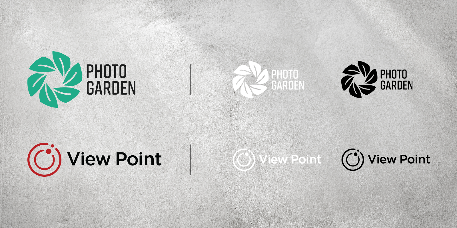
I created two different brands, then established the companies’ mission statements, goals, and tone. This all influenced the logo signature and overall art direction of the brand campaigns.


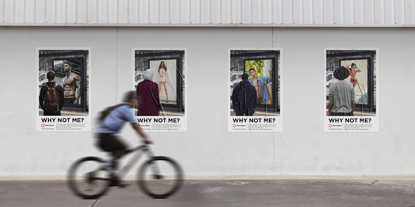


This is the first poster series used in the experiment under the View Point branding. Their mission is to create a new outlook in the world that shows people that being different is not only to be tolerated but celebrated. These posters were placed in buildings around Fairfax, VA with a call to action to take a survey. This survey helped me to assess the poster’s effectiveness as well as document engagement.
This series is based on the idea of relatability for the audience. I wanted the viewers to question the media just like the people with their backs to them. I chose the backs of people that I felt contrasted the typical media standard in different ways.


This is the second poster series used in the experiment under the Photo Garden branding, whose mission is to provide high-quality professional assets and tools. These posters were also placed in the same buildings around Fairfax, VA at a later date with a call to action to take a survey.
These posters are all meant to undermine the previous campaign. This is based on the idea presented in several propaganda pieces I looked at. They often would create unflattering caricatures or show unflattering scenes to weaken the power and message of their enemies. They wanted their viewer to see their enemies as flawed and not well thought out. The posters do this by showing the need for some forms of editing in almost comical scenarios such as a stain on the shirt or food in the model’s teeth. This takes focus away from the real issue at hand and targets a very specific editing need that was not previously addressed.


After gathering all the surveys, it was clear that not only did the audience feel they understood the purpose of the poster but agreed with its subject matter even though they were opposing arguments! Further, the concentrated placement of the poster meant that the audience would generally be similar demographics. There was also a persuasion rate of over 15% in both cases of people feeling that their beliefs were changed by the poster series.
My conclusion was ultimately that both series were successful in the objective of grabbing attention and conveying the desired message, which further begs the question of ethics. What we as designers put out in the world clearly has an effect. Ethics and impact should always be something considered throughout the marketing and design process and is an important part of the designer’s responsibility.


.svg)